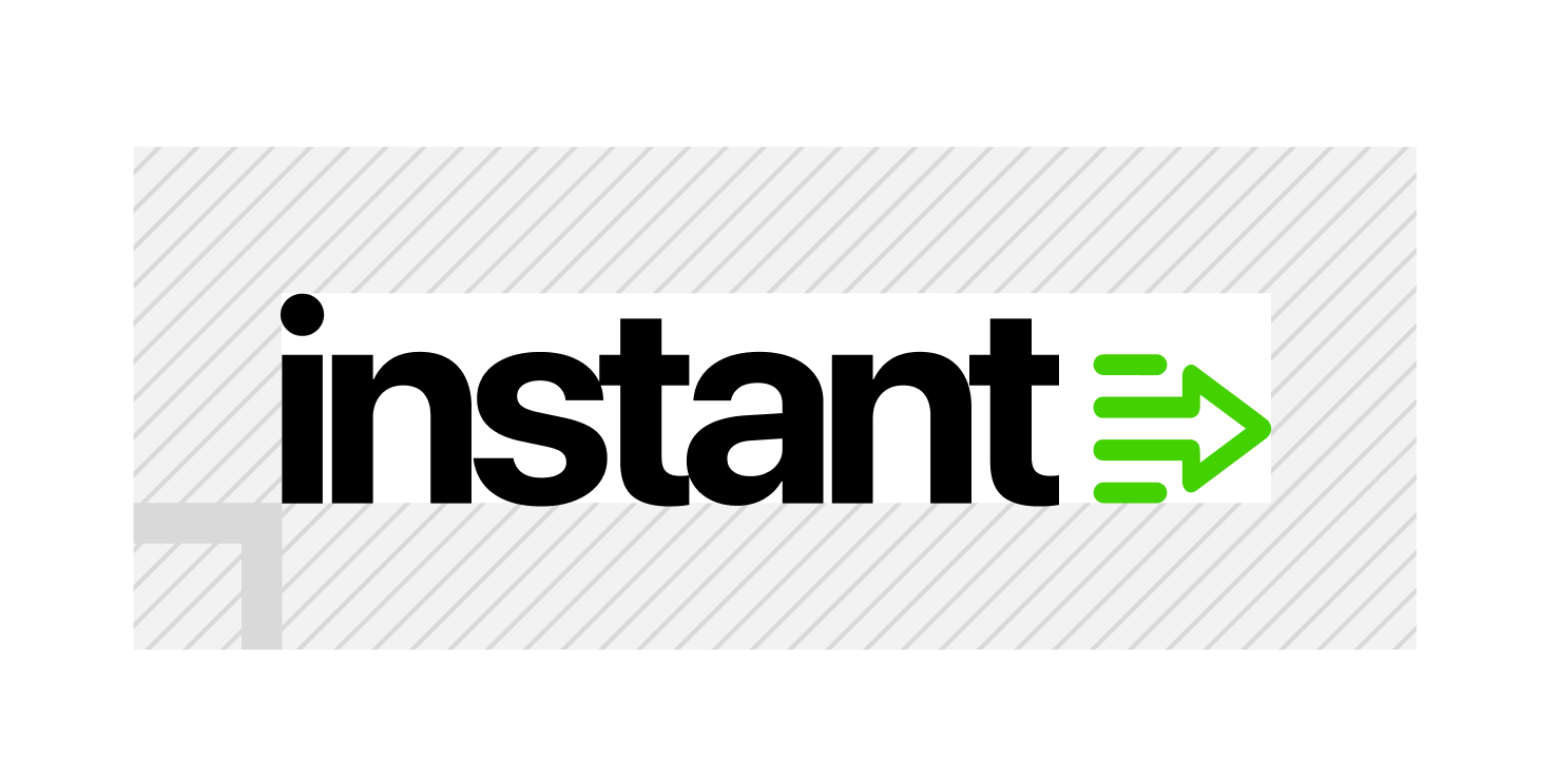
The arrow icon signals momentum, the idea that Instant is always pushing forward, always driving output, never standing still. Seeing the mark should evoke a feeling of energy of a platform that works faster, and smarter than the alternatives.
The symbol is sized to the x-height of the wordmark. Not the cap height, not the full ascender. The x-height. This keeps it optically balanced with the lowercase letters and gives the lock-up its sense of cohesion.
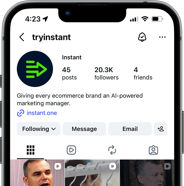
On its own, the symbol is reserved for contexts where the full lock-up isn't practical. Profile images, favicons, and graphic compositions where Instant's presence is already established. In every other situation, the full lock-up is the correct choice.
The symbol always renders in Core Green. It never changes to white, black, or any other color outside the three approved variants. The green is what makes it instantly visible, recognizable, and unmistakably Instant.