


09
Website
Website principles
These are the principles that govern every page on the Instant website. They are not aesthetic preferences. They are the standards that every design decision should be held against before anything goes live.
Hierarchy first
Every page has one job. Every section has one message. Every element should know its place in the visual order and stay there. If a layout requires effort to understand, it isn't finished yet.
Revenue is the hero
Numbers, results, and proof points should always be the most visually prominent elements on any conversion-critical page. A large green revenue figure will always outperform a paragraph of copy explaining the same thing.
Interaction adds life
Every interaction is an opportunity to surprise and delight. Hover states, scroll animations, and micro-interactions are not decorative extras, they are what separate a website that feels built from one that feels designed.
Enter the AI-powered era of email marketing
Get Started

LAST 90 DAYS
Your performance with Instant AI
$2,491,738.44
Instant revenue generated
Top performing flow
Open rate
Revenue per recipient
Click through rate
Browse Abandonment
$15


Mobile is not an afterthought
Every layout is designed for mobile from the start, since most of our inbound traffic comes through mobile devices. The mobile experience should feel as considered and intentional as the desktop version of the site.


“We didn’t need a full rebuild, we just needed smarter retention. Instant AI helped us turn on personalized flows quickly and start capturing demand we were missing and the ROI was extremely impressive.
Brianna Garriott
Director of Marketing, ettitude


Let it breathe
Whitespace is not wasted space. It is what makes every element on the page feel intentional and considered. Generous spacing between sections, components, and typographic elements gives the content room to land and the reader room to process.
Power your email and SMS marketing with AI
What’s you work email?
Get Started

Consistent, not rigid
The design system exists to create consistency, not to prevent creativity. Every page should feel unmistakably Instant while still being designed for its specific purpose and audience.
Breakpoints
The Instant website is built on a responsive grid system with five primary breakpoints. Every layout is designed to work across all of them. Always design to the correct max-width for each breakpoint and never allow content to stretch beyond these bounds.
Breakpoint
Desktop
Desktop 2
Laptop
Tablet
Mobile
Screen Width
1440px and above
1280px to 1439px
1024px to 1279px
844px to 1023px
375px to 843px
Margin
120px
96px
64px
40px
16px to 20px
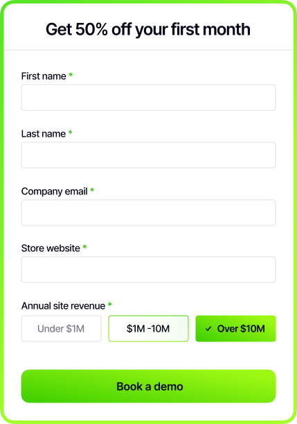
The form
The Instant demo form is the most important conversion moment on the website. It has been redesigned from a single page showing all fields at once to a stepped experience that presents one question at a time, reducing the perceived effort of completing it and making the process feel fast and considered rather than like a data collection exercise.
Showing every field at once is overwhelming. Showing one at a time keeps the visitor focused and moving forward. The Core Green progress bar at the top of each step does the motivational work, making it immediately clear how close the visitor is to being done and giving them a reason to keep going rather than a reason to stop.
Old form
All fields presented at once on a single screen. First name, last name, company email, store website, and annual revenue selector all visible before the visitor has committed to anything. Higher perceived effort, higher drop-off.
step 2/3
← Back
What’s your work email?
Next

New form
One question per step with a Core Green progress bar tracking completion at the top of the screen. Each step focuses the visitor on a single input, making the process feel achievable and fast. The "Next" button with a forward arrow keeps the momentum going until the final "Book a demo" CTA closes the conversion.
Type scale
The website type scale is derived from the core Instant type system but adapted specifically for screen. Desktop and mobile sizes are defined separately. Always use the correct size for the correct breakpoint and never scale type manually outside of these values.
Style
Display
Heading 1
Heading 2
Heading 3
Body Large
Body Small
CTA
Label
Desktop Size
64px
48px
24px
20px
20px
18px
16px
14px
Mobile Size
44px
36px
24px
20px
18px
16px
16px
14px
Weight
Semibold
Semibold
Semibold
Semibold
Medium
Medium
Semibold
Medium
Tracking
-5%
-5%
-5%
-5%
-5%
-5%
-5%
-5%
Line Height
120%
120%
120%
120%
120%
120%
120%
120%
Desktop
Display: 64px
Inter Semibold
Leading: 120%
Tracking: -5%
Let Instant handle it.

Heading 1: 48px
Inter Semibold
Leading: 120%
Tracking: -5%
Let Instant handle it.
Heading 2: 24px
Inter Semibold
Leading: 120%
Tracking: -5%
Let Instant handle it.
Heading 3: 20px
Inter Semibold
Leading: 120%
Tracking: -5%
Let Instant handle it.
Body Large: 20px
Inter Medium
Leading: 120%
Tracking: -5%
Let Instant handle it.
Body Small: 18px
Inter Medium
Leading: 120%
Tracking: -5%
Let Instant handle it.
CTA: 16px
Inter Semibold
Leading: 120%
Tracking: -5%
Let Instant handle it.
Label: 14px
Inter Medium
Leading: 120%
Tracking: -5%
Let Instant handle it.
Mobile
Display: 44px
Inter Semibold
Leading: 120%
Tracking: -5%
Let Instant handle it.
Heading 1: 36px
Inter Semibold
Leading: 120%
Tracking: -5%
Let Instant handle it.
Heading 2: 24px
Inter Semibold
Leading: 120%
Tracking: -5%
Let Instant handle it.
Heading 3: 20px
Inter Semibold
Leading: 120%
Tracking: -5%
Let Instant handle it.
Body Large: 18px
Inter Medium
Leading: 120%
Tracking: -5%
Let Instant handle it.
Body Small: 16px
Inter Medium
Leading: 120%
Tracking: -5%
Let Instant handle it.
CTA: 16px
Inter Semibold
Leading: 120%
Tracking: -5%
Let Instant handle it.
Label: 14px
Inter Medium
Leading: 120%
Tracking: -5%
Let Instant handle it.


Last Updated April 2026 © Instant