


07
Illustration
Our approach
Rather than abstract illustration or custom artwork, Instant's visual language leans on the product itself as the primary illustrative element. The UI is clean, data-rich, and genuinely impressive. Putting it front and center, treated with care and presented at its best, communicates more about the product than any diagram or graphic could.
UI is used across ads, landing pages, social content, presentations, and event materials. In every context, the goal is the same: make the product look like something you want to use.
Product UI
When product UI appears in advertising and marketing materials, it is never a flat screenshot. It is composed, lit, and treated to feel premium and three-dimensional. Screens sit at considered angles, overlapping where it creates depth, and always presented within realistic device frames where relevant. The UI should always show real, finished product states with no placeholder data or incomplete flows.
The product team's Figma files are the best source for up to date UI components. Pull from these wherever possible and simplify as needed so the viewer sees only what is relevant to the message being communicated.
Diagrams
Diagrams are one of the most powerful tools in the Instant visual system. When a statistic, result, or product capability needs to land immediately and without ambiguity, a well-designed diagram does it faster than any paragraph of copy. The best Instant diagrams make the impact of the product feel visceral and undeniable.
Small decorative sparkle or star elements are used to add energy and visual interest to key moments in a diagram, particularly around the highest data point or the most impactful result. These should feel light and celebratory, not cluttered.
Effects
Effects are important graphic touches to create depth, dimension, and visual interest. The general rule is simple: drop shadows on light backgrounds, glow on dark. On light backgrounds, drop shadows lift UI elements off the surface and prevent compositions from feeling flat and static. On dark backgrounds, glow creates a sense of ambient light that makes elements feel alive and in motion. Together they ensure that Instant visuals always feel considered and three-dimensional, regardless of the background they are built on.
Never overuse either effect. Subtlety is always the goal. An effect that draws attention to itself has stopped doing its job.
Resources
Total sales over time
$9.3M
+31%
$10M
$7.5M
$5M
$2.5M
$0

Jan 2026
Mar 2026
May 2026
Apr 2026
May 2026
Jun 2026

Instant Revenue Lift

Retention Sales

Drop shadows
Drop shadows are used to lift UI elements off light backgrounds and create a sense of depth and dimensionality. All drop shadows in the Instant system are created using the Beautiful Shadows Figma plugin, which generates multi-layered shadows that feel natural and considered rather than flat and generic.
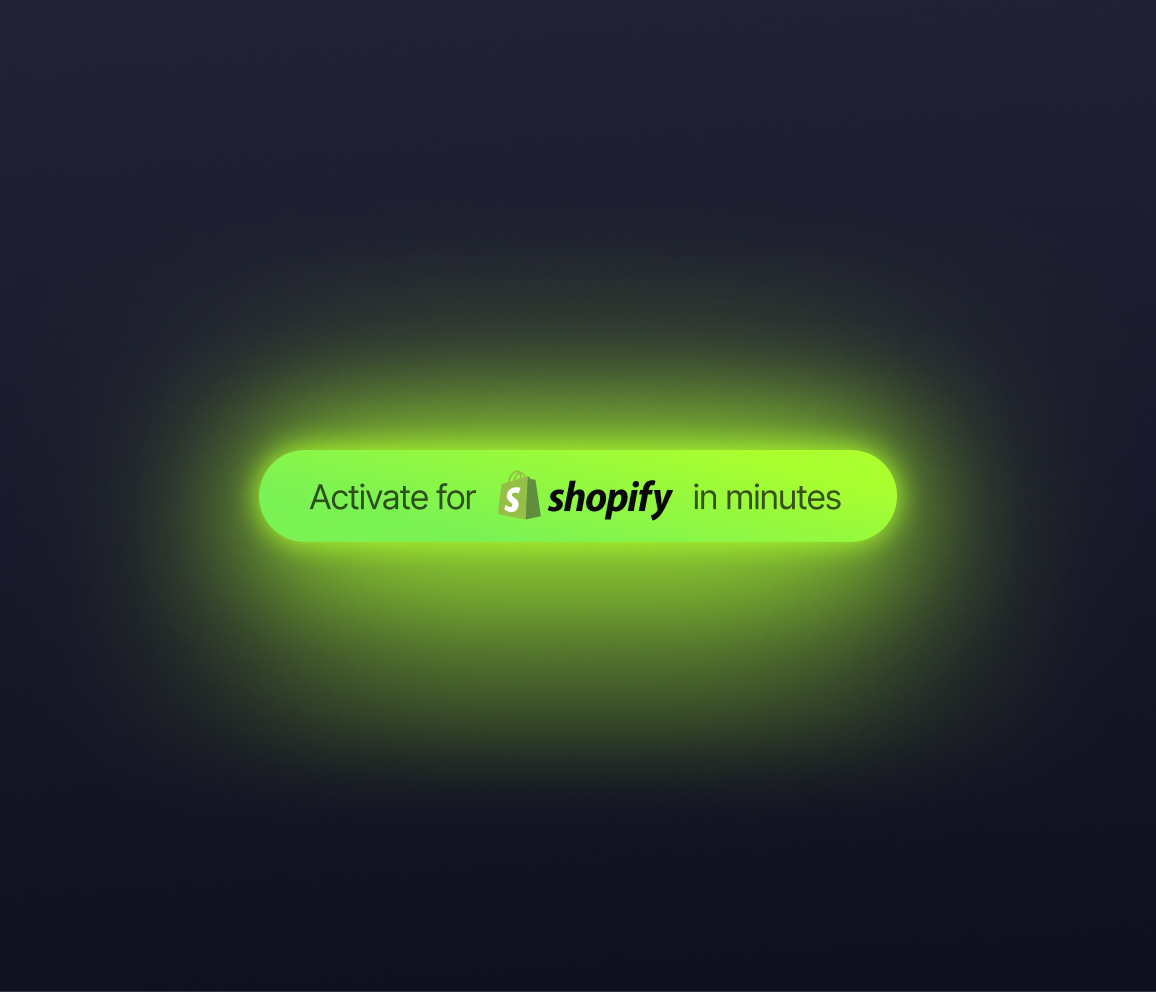
Glow
On dark backgrounds, a subtle glow effect adds a layer of visual depth and modernity that elevates UI compositions from clean to genuinely striking. Glow is applied as a soft, diffused light source behind or beneath UI elements, most commonly in Core Green, creating a halo of brand color that ties the UI directly to the palette.


Last Updated April 2026 © Instant