


11
Ads
The goal
Every Instant ad is built to speak to one specific audience: Shopify store owners and retention marketers. The goal is always the same: convince them to book a demo. In the cluttered and chaotic landscape of social media, that means finding what resonates about Instant, figuring out how to explain it in the fastest and clearest way possible, and making the product so appealing that taking action feels like the obvious next step.
Every creative we make is held against four tenets. The best ads hit all of them. At minimum, they hit one hard enough to make the viewer stop scrolling.
Emotional connection
The viewer sees themselves in the ad immediately. The situation, the frustration, or the aspiration feels so specific and so accurate that the reaction is instinctive. Think: “This is literally me.”
Problem connection
The ad surfaces a problem the viewer has been aware of but hasn't acted on. It makes avoiding it feel more costly than solving it. Think: “I can't keep putting this off.”
Desire connection
The outcome shown in the ad is compelling enough to create immediate want. The viewer doesn't just understand the value, they feel it. Think: “I need this now.”
Proof that de-risks activation
Real numbers, real brands, and real results remove the hesitation that sits between interest and action. The viewer feels like not doing this is the bigger risk. Think: “I'd be leaving money on the table.”
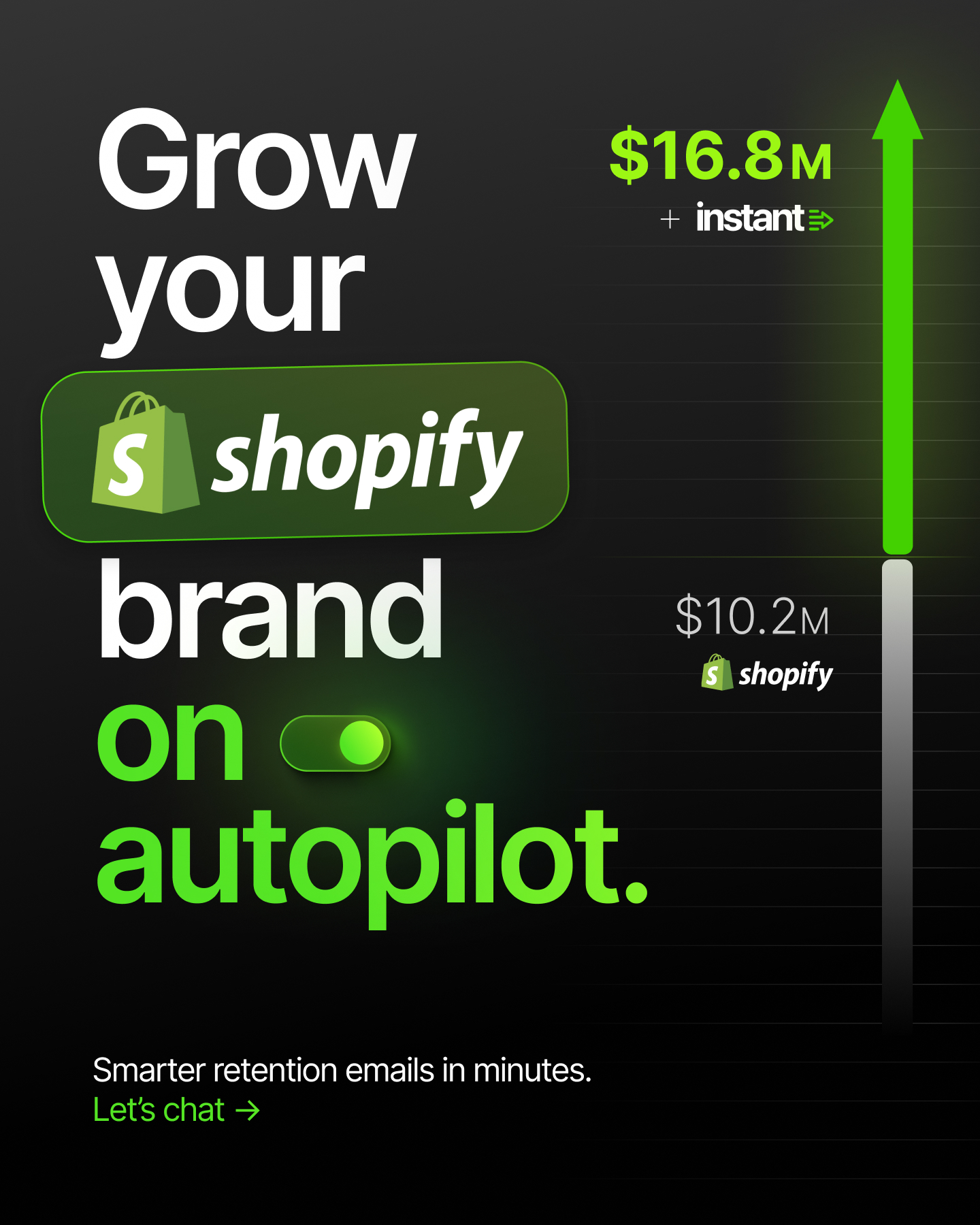
Shopify brands
Referencing Shopify in ads consistently outperforms ads that don't. Our audience is Shopify store owners, and seeing Shopify called out directly signals that Instant was built for them specifically. The Instant x Shopify lock-up, the Shopify logo appearing alongside product UI, or a headline that speaks directly to the Shopify experience all increase relevance and resonance with the people we are trying to reach.
Always look for natural opportunities to bring Shopify into the creative. It is one of the simplest and most reliable ways to make an ad feel immediately relevant to the right audience.
Launch for same day →

Calling out Shopify within text
he Shopify bag icon replaces the word "Shopify" inline within a headline, creating a visual interruption that catches the eye of exactly the right audience without breaking the flow of the copy. It signals platform relevance instantly and makes the ad feel built for Shopify store owners specifically, not just eCommerce broadly.


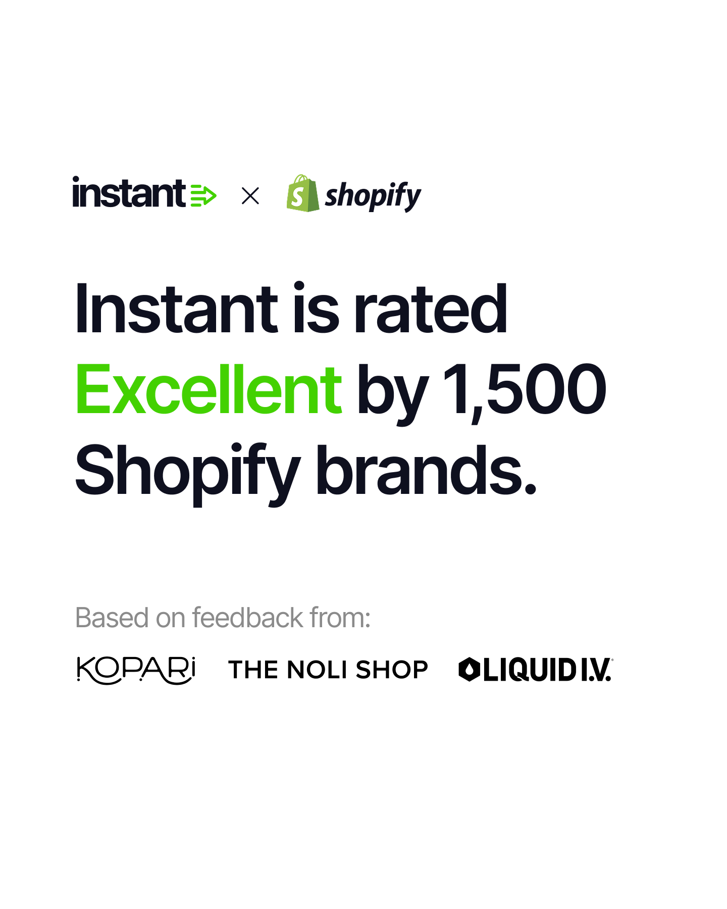
Instant x Shopify Lockup
The co-branded lock-up places Instant and Shopify side by side, separated by the Phosphor x icon. Used as a standalone visual or as a header treatment within an ad, it establishes the partnership immediately and frames Instant as the natural addition to a Shopify store. For an audience of Shopify brands, seeing both logos together is one of the fastest ways to signal that this product was made for them.
Photography
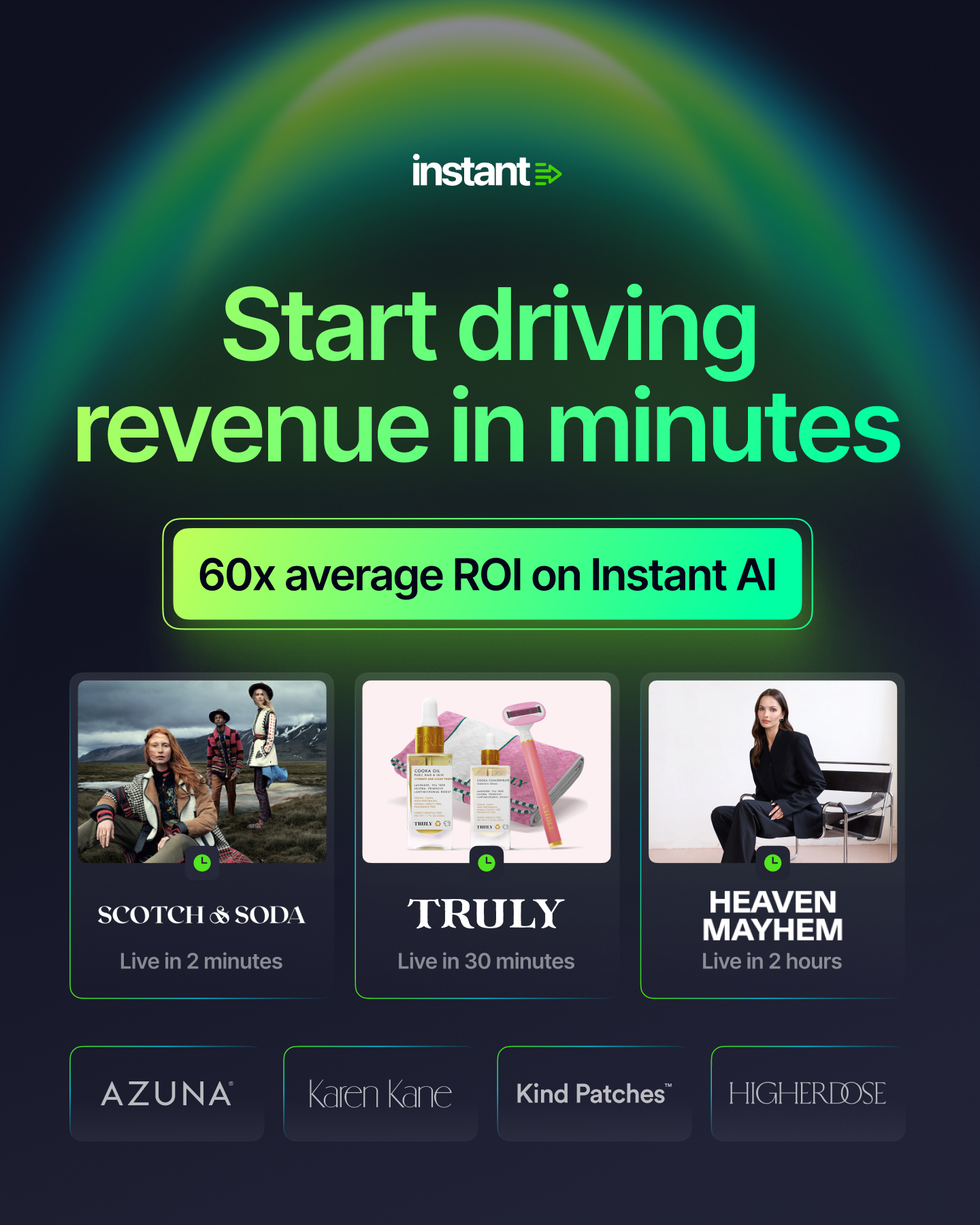
Instant ads draw on real brand photography and real customer results wherever possible. Featuring the imagery of the brands using Instant makes every ad more credible and more relevant to the eCommerce operators seeing it. A recognizable brand name paired with a specific revenue result is one of the most effective creative combinations in the Instant playbook.
Always lead with the outcome. A dollar figure, a multiplier, a specific result that makes the value of Instant impossible to ignore. Supporting copy is kept short and specific, always answering the question the viewer is already asking: what does this do and what will it earn me.
Messaging tree
The messaging tree is how the paid ads team organizes and plans ad campaigns on Meta. Every creative we run sits within a messaging bucket, which makes it easy to see which categories are performing, which need more iterations, and where there are gaps in our coverage. It also ensures we are always testing something new while keeping our best performers live and spending.
Over time, running ads across these buckets has shown us clearly which messages resonate most with Shopify store owners and which ones are still finding their feet. The proven concepts are always running. They are the foundation of the paid strategy and the benchmark everything else is measured against.
Proven concepts
These are the messaging categories that have demonstrated consistent ability to drive leads and demo bookings. Incentive ads, which offer a tangible reward for booking a demo, are by far the strongest performer in the entire tree. Revenue ads show the audience the specific dollar uplift their store could see after activating Instant, using real numbers and real brand results to make the outcome feel credible and achievable. Thought leader ads position Instant as the platform the smartest Shopify brands are already using, working particularly well for warming audiences who are not yet ready to book. These three categories are always running and always being refreshed with new creative iterations.
Growing concepts
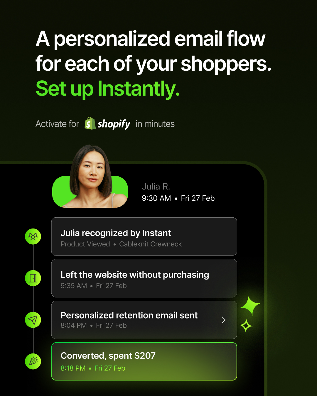
These buckets have generated leads and show enough signal to keep investing in, but are not yet proven at the same scale as the top performers. Messy flows speaks to the pain of managing too many disconnected email sequences. Personalized emails showcases the AI-driven 1:1 personalization that makes every send feel individual. Auto optimize highlights the platform's ability to continuously improve performance without manual input. A team positions Instant as the equivalent of hiring a full retention marketing team, available from day one. Each of these is actively being developed with more creative iterations to find the executions that unlock their potential.
Trial concepts
These are newer messaging directions being tested for the first time without enough data yet to assess their potential. Current customers, send time optimization, smart coupons, the Retention OS, and custom messaging concepts are all in active experimentation. These run at lower budgets until the signal is clear. Some will graduate to growing concepts. Some will be retired. The only way to know is to test.
Resources
Concept to creative
Every top-performing Instant ad starts as a rough concept and goes through multiple rounds of iteration before it earns its place as a proven creative. The process moves from a raw idea through design and copy exploration, refinement of the message, and finally a polished execution that is ready to scale. These four examples show how that process works in practice.
Revenue
The revenue concept started as a straightforward static case study ad, small brand logos and revenue numbers laid out cleanly on a dark background. It performed, but the message wasn't landing with the urgency the results deserved. The next iteration introduced the toggle mechanic: a simple on/off switch showing the before and after of activating Instant, brought to life through animation. That version became a top performer. The concept was then pushed even further with a more dramatic animated execution that visualized the toggle moment through contrasting worlds. Before Instant: a tumbleweed rolling through an empty western ghost town. After Instant: the same toggle flipped, and the scene transforms into the energy of a bustling New York City street. The idea of going from quiet to overwhelming revenue activity, instantly, had never been more visceral or more on brand.
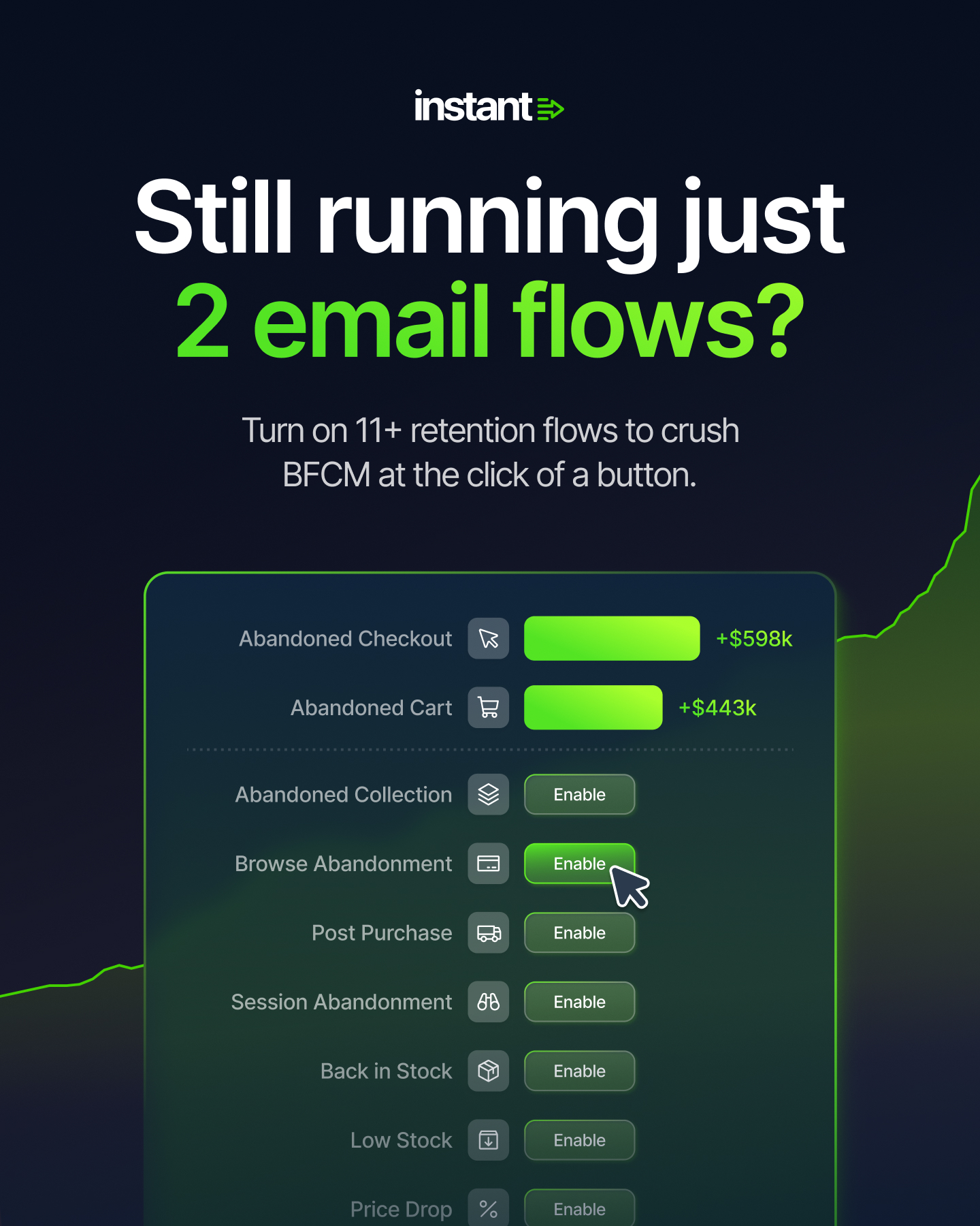
Flows
The flows concept started by calling out a specific pain point that almost every Shopify store owner recognizes: still running just two email flows while leaving revenue on the table. Early executions used product UI to show what those two active flows looked like in the Instant dashboard, with the inactive ones greyed out waiting to be turned on. The message was clear but the creative felt functional rather than exciting. The next iteration flipped the framing entirely, speaking to the opposite problem. "Retention email flows out of hand?" targeted brands that had too many messy retention flows running across different tools, with no clear picture of what was working. Showing the Instant dashboard as the single source of control for all of it reframed the product from a simple add-on to an essential operational tool.
Incentive
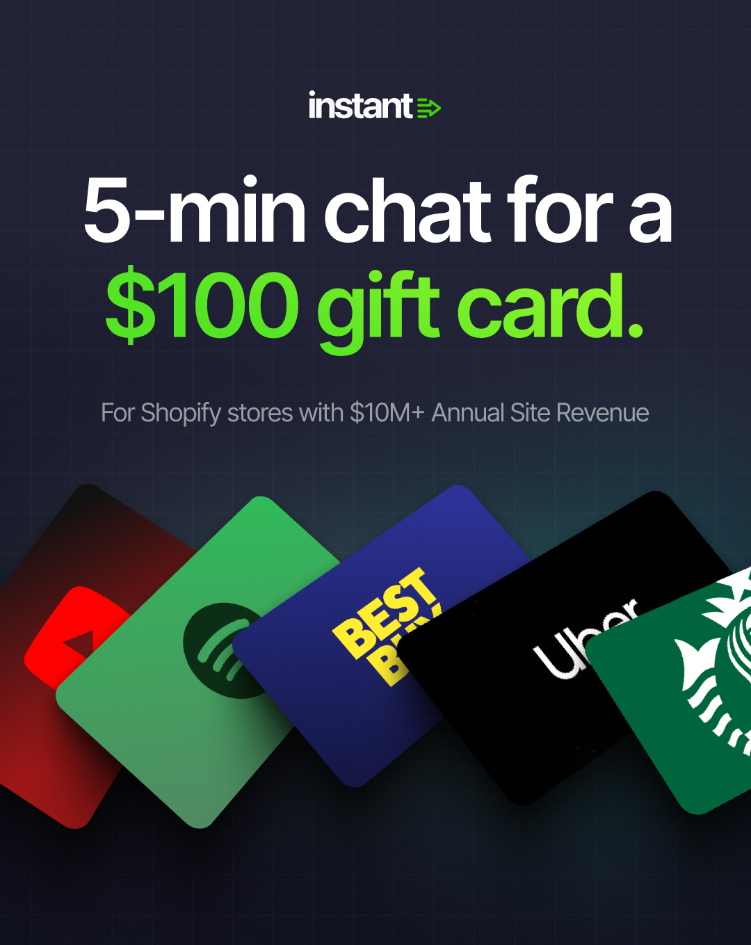
The incentive concept started with a clean and direct offer: spend 5 minutes in a chat and walk away with a $100 gift card. Book a demo, get rewarded. That creative performed strongly because the value exchange was immediate and tangible. The next iteration took that idea further by connecting the $100 to a much bigger story. Our average Shopify brand makes $300k in incremental revenue every month with Instant. That is $100 every 15 minutes. The demo gift card stopped being just an incentive and became proof of what the product actually delivers. Both ideas living in the same ad made the offer feel like a preview of the revenue to come rather than just a giveaway.
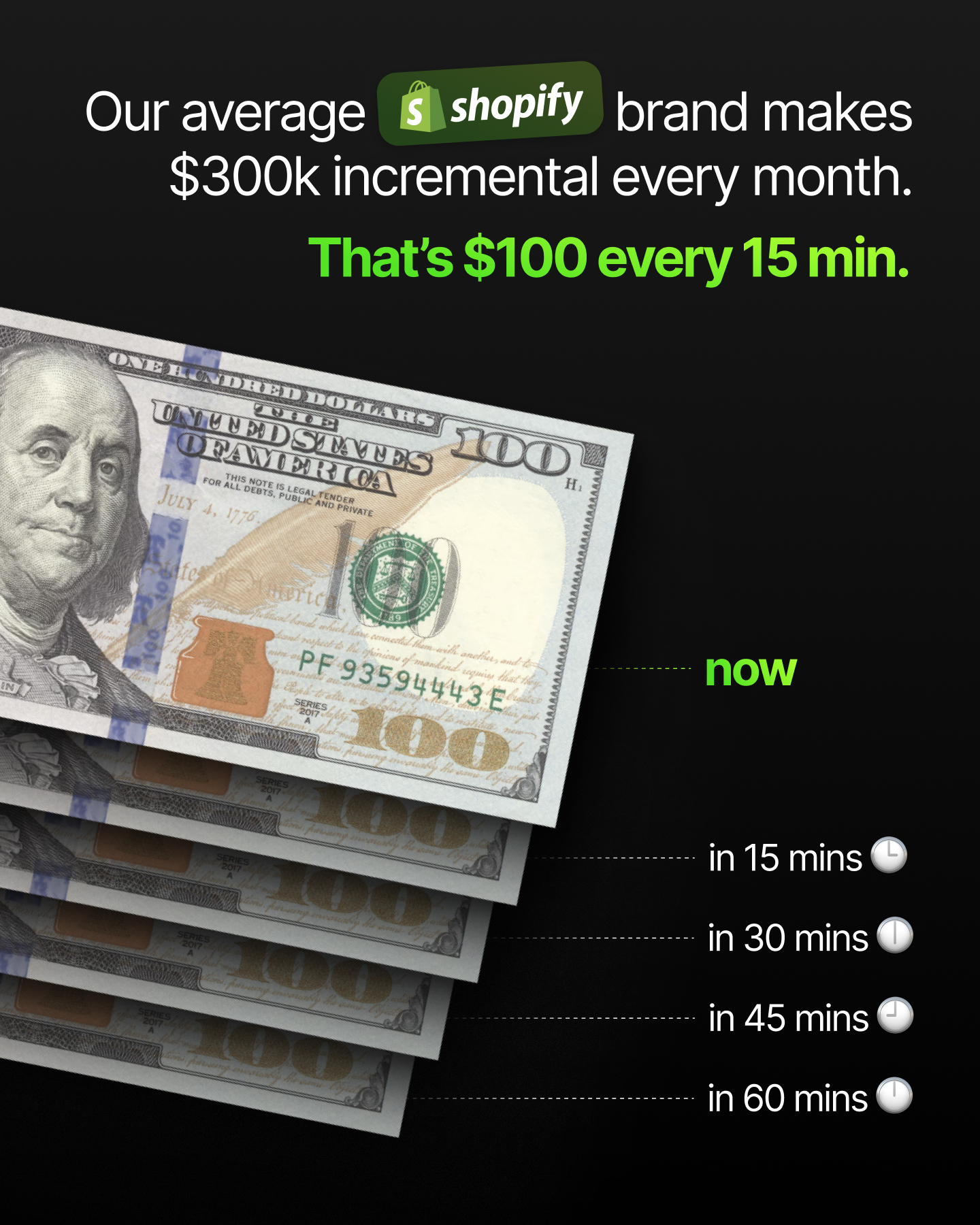
The final iteration stripped the complexity out and let the motion do the work. Every 15 minutes, as the clock hands sweep around, $100 pulls directly into a Shopify bag. No explanation needed. No data table. Just a simple, looping animation that makes the revenue feel real, rhythmic, and relentless. The concept went from a straightforward incentive ad to one of the most visually distinctive and emotionally compelling creatives in the Instant library.
Case studies in ads
Case study results are one of the highest-performing creative formats in the Instant ad system. A real brand, a real number, and a real result. These ads work because they are specific, credible, and directly relevant to the operators seeing them.
Always lead with the dollar figure at display size in Core Green. Follow with the brand name and a one-line description of the result. Keep everything else minimal. The number is the headline. Everything else is context.
Revenue results always follow the approved format: +$7.2M, +$3.2M, +$200k. Always the plus prefix, always the dollar sign, always abbreviated. Never write out the full number and never omit the prefix.
Brands we can use in ads
- Karen Kane
- Parisa Wang
- July
- The Collagen Co.
- Liquid I.V.
- Holden
- Kopari
- Linda’s
- Nakie
- The Noli Shop
- Runaway The Label
- ettitude
Brands we never use in ads
- David Protein
- Heaven Mayhem
- Wallace Bishop
- Incu
- Kind Patches
Resources
Design iterations
Every ad goes through multiple creative directions before one is scaled. Visual hierarchy, layout, color treatment, and the balance between UI and photography are all variables worth exploring. What looks like the strongest creative in a review often surprises in market, and what looks like a long shot sometimes becomes the top performer.
Produce at least two to three distinct visual directions for every campaign before testing. Not variations of the same idea, but genuinely different approaches to communicating the same message. The creative that gets scaled should be the one the data selects, not the one that felt safest in the brief.
CTA messaging
The CTA is the last thing the viewer sees before they decide whether to act. It should be specific, urgent, and directly connected to the offer or message in the ad. Generic CTAs like "Learn more" or "Click here" are never used in Instant ads.
The primary CTA across most Instant ads is "Get started" or "Book a demo" depending on the objective. For offer-led ads, the CTA should reflect the offer directly: "Claim 50% off" or "Start your free trial." For incentive ads, "Book 15 mins. $100 gift card on us." connects the action directly to the reward. For case study ads, "See how they did it" connects the result to the next step without being generic.
Always test CTA copy alongside the creative. A stronger CTA on the same ad can meaningfully change conversion rates. Treat it with the same rigor as the headline.
Inline CTA
A clean, minimal call to action that sits naturally within the layout without demanding its own space. Utilize colors and spacing to create hierarchy. On Meta, the native interactive button handles the conversion moment while the inline CTA just needs to point the way.

Download the free guide

Button CTA
A full button treatment with a cursor hovering over it, styled with a soft green glow that makes the action feel alive and ready to fire. The cursor adds a layer of interactivity that makes the viewer feel like the click is already happening. Used in motion assets, the cursor animates in and clicks, handing off to the next scene with the energy of someone who just made the right decision.
Best practices
These are the principles that the Instant creative team has learned through building and testing hundreds of ads. They are not rules for their own sake. They are the things that consistently make the difference between an ad that performs and one that doesn't.
Reference Shopify early
The Instant x Shopify lock-up, the Shopify logo in the UI, or a headline that speaks directly to Shopify store owners all signal immediately that this ad is for them. Don't make the audience work out whether Instant is relevant to their business. Tell them in the first frame.

Lead with the number
A specific dollar figure in the headline will almost always outperform a broad claim. "$200k in incremental revenue every month" is more compelling than "grow your email revenue." The number is the proof. Put it first.
Keep pushing the visual on proven concepts
When the data confirms a message is working, the job is not done. A proven concept is an invitation to explore how many different ways that message can be expressed visually.
Keep the visual hierarchy ruthless
One hero element per ad. One thing the viewer should see first. Everything else is supporting information. If two things are competing for attention, one of them needs to be called to attention or removed. Whenever possible, remove visual clutter.
Use real brand creative wherever possible
Ads that feature the video, photography, colors, and visual identity of real brands using Instant outperform generic visuals. The audience sees a brand they recognize or aspire to be, paired with a result that feels achievable. The flasher the media the better.
Let the data decide
The instinct to scale the most polished or visually impressive creative is almost always wrong. Scale the creative the data selects, even if it is simpler or less refined than expected. The best performing ads in the Instant library have often been the ones that are simple graphics and straight to the point in messaging.


Last Updated April 2026 © Instant